Figure Generation
The ccutils Module
This work required several home-made Python functions. To ensure reproducibility, we have written it as a Python module that can be installed from the master branch of the GitHub repository. Please see the installation instructions for details. This module is required to execute all of the following scripts.
Main Text Figure Generation
This section contains all of the scripts necessary along with the required datasets to reproduce all plots from the main text. Click on the preview images to obtain a PDF version of the figure, or click on the script title to download the .py file to reproduce the figure.
Mean (solid line) $\pm$ standard deviation (shaded region) for the mRNA (upper panel) and protein (lower panel) dynamics. Cells spend a fraction of the cell cycle with a single copy of the promoter (light brown) and the rest of the cell cycle with two copies (light yellow). Black arrows indicate time of cell division.
Necessary Data Sets• Matrix to compute moment dynamics.
• Coefficient matrix to compute mRNA and protein distribution moments after cell division.
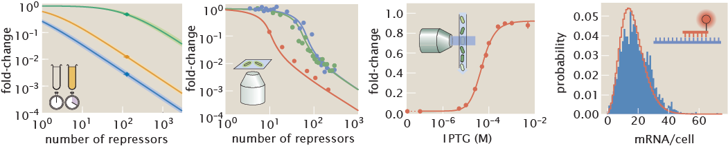
Zero parameter-fit predictions (lines) and experimental data (circles) of the gene expression fold-change (upper row) and noise (lower row) for repressor binding sites with different affinities (different columns) and different repressor copy numbers per cell (different lines on each panel). Error bars in data represent the 95% confidence interval on the quantities as computed from bootstrap estiamates generated from the single-cell fluorescence measurements. In the theory curves dotted lines indicate plot in linear scale to include zero while solid lines indicate logarithmic scale. White dots on the lower row are plotted on a different scale for visual clarity.
Necessary Data Sets• Moments of mRNA and protein distribution over cell cycle.
• Bootstrap gene expression fold-change and gene expression noise.
Predicted protein distributions under different inducer (IPTG) concentrations for different combinations of repressor-DNA affinities (columns) and repressor copy numbers (rows).
Necessary Data Sets• Maximum entropy Lagrange multipliers for protein distribution.
Predicted protein cumulative distributions (color dots) with corresponding theoretical predictions (dashed lines) for unindiced and fully induced conditions.
Necessary Data Sets• Maximum entropy Lagrange multipliers for protein distribution.
• Single-cell fluorescence intensities.
Channel capacity as inferred using the Blahut-Arimoto algorithm [41] for varying number of repressors and repressor-DNA affinities. All inferences were performed using 12 IPTG concentrations as detailed in the Methods. Lines represent zero-parameter fit predictions done with the maximum entropy distributions as those shown in Fig. 4. Points represent inferences made from single cell fluorescence distributions (See Appendix S7 for further details). Solid lines indicate plot in logarithmic scale, while dashed line indicates linear scale ton include zero.
Necessary Data Sets• Theoretical channel capacity for different biophysical parameters.
• Experimental determination of the channel capacity.
Lower panel illustrates that zero channel capacity indicates that all distributions overlap. Upper panel illustrates that as the channel capacity increases, the separation between distributions increases as well.
Necessary Data Sets• Maximum entropy Lagrange multipliers for protein distribution.
Supplemental Information Figure Generation
This section contains the scripts and links to the necessary datasets to generate all figures in the supplemental materials.
- Fig. S01. lacUV5 mRNA per cell distribution
-
Data from Jones et al., 2014 of the unregulated lacUV5 promoter as inferred from single molecule mRNA FISH.
Necessary Data Sets
-
- Fig. S02. MCMC posterior distribution for RNAP rates.
- Posterior distribution for rate parameters for unregulated promoter assuming a single gene copy.
- Fig. S03. Experimental vs. theoretical distribution of mRNA per cell using parameters from Bayesian inference
-
Theoretical vs. experimental mRNA distribution as inferred from the two-state model and the data.
Necessary Data Sets
-
- Fig. S04. Separation of cells based on cell size
-
Using the area as a proxy for position in the cell cycle, cells can be sorted into two groups – small cells (with one promoter copy) and large cells (with two promoter copies).
Necessary Data Sets
-
- Fig. S05. mRNA distribution for small and large cells
-
mRNA distributions for two groups of cells separated by cell size.
Necessary Data Sets
-
- Fig. S06. MCMC posterior distribution of RNAP rates for a multi-promoter model.
- Posterior distribution for rate parameters for unregulated promoter accounting for gene copy number variations during the cell cycle.
- Fig. S07. Experimental vs. theoretical distribution of mRNA per cell using parameters for multi-promoter model
-
Experimental vs. theoretical mRNA distributions for two groups of cells separated by cell size.
Necessary Data Sets
-
- Fig. S08: mRNA and protein moment dynamics.
-
Mean (solid line) $\pm$ standard deviation (shaded region) for the mRNA (upper panel) and protein (lower panel) dynamics. Cells spend a fraction of the cell cycle with a single copy of the promoter (light brown) and the rest of the cell cycle with two copies (light yellow). Black arrows indicate time of cell division.
Necessary Data Sets
• Matrix to compute moment dynamics.
• Coefficient matrix to compute mRNA and protein distribution moments after cell division.
-
- Fig. S09. Comparison of the equilibrium and kinetic reressor titration predictions.
-
Repressor titration curve inferred from an equilibrium model (solid lines) and a kinetic non-equilibrium model (dots and triangles).
Necessary Data Sets
• Matrix to compute moment dynamics.
• Coefficient matrix to compute mRNA and protein distribution moments after cell division.
-
- Fig. S10. Comparison of the equilibrium and kinetic inducer titration predictions.
-
Inducer titration curve inferred from an equilibrium model (solid lines) and a kinetic non-equilibrium model (dots and triangles).
Necessary Data Sets
• Matrix to compute moment dynamics.
• Coefficient matrix to compute mRNA and protein distribution moments after cell division.
-
- Fig. S11. Comparison of the predicted protein noise between a single- and a multi-promoter kinetic model.
-
Comparison of the noise (standard deviation/mean) between a kinetic model that considers a single promoter at all times (dashed line) and the multi-promoter model developed in this section (solid line) for different repressor operators.
Necessary Data Sets
• Moments of mRNA and protein distribution over cell cycle for multi-promoter model.
• Moments of mRNA and protein distribution for single-promoter model.
-
- Fig. S12. Protein noise of the unregulated promoter.
-
Comparison of the experimental noise for different operators with the theoretical predictions for the single-promoter and the multi-promoter model.
Necessary Data Sets
• Moments of mRNA and protein distribution over cell cycle for multi-promoter model.
• Moments of mRNA and protein distribution for single-promoter model.
• Bootstrap gene expression fold-change and gene expression noise.
-
- Fig. S13. Protein noise of the regulated promoter.
-
Comparison of the experimental noise for different operators.
Necessary Data Sets
• Moments of mRNA and protein distribution over cell cycle for multi-promoter model.
• Moments of mRNA and protein distribution for single-promoter model.
• Bootstrap gene expression fold-change and gene expression noise.
-
- Fig. S14. Systematic comparison of theoretical vs experimental noise in gene expression.
-
Theoretical vs. experimental noise.
Necessary Data Sets
• Moments of mRNA and protein distribution over cell cycle for multi-promoter model.
• Bootstrap gene expression fold-change and gene expression noise.
-
- Fig. S15. Maximum entropy distribution of six-face die.
- Example distribution for a six-face die inferred from the value of the mean face value using Maximum Entropy.
- Fig. S16. Maximum entropy mRNA distributions for simple repression constructs
-
Predicted mRNA distributions under different inducer (IPTG) concentrations for different combinations of repressor-DNA affinities (columns) and repressor copy numbers (rows).
Necessary Data Sets
• Maximum entropy Lagrange multipliers for mRNA distribution.
-
- Fig. 17. Maximum entropy protein distributions for varying physical parameters
-
Predicted protein distributions under different inducer (IPTG) concentrations for different combinations of repressor-DNA affinities (columns) and repressor copy numbers (rows).
Necessary Data Sets
• Maximum entropy Lagrange multipliers for protein distribution.
-
- Fig. 18. Experiment vs. theory comparison for ∆lacI strain.
-
Comparison of experimental and theoretical cumulative distribution functions for the unregulated promoter.
Necessary Data Sets
• Maximum entropy Lagrange multipliers for protein distribution.
-
- Fig. 19. Experiment vs. theory comparison for regulated strain.
-
Comparison of experimental and theoretical cumulative distribution functions for the regulated promoter.
Necessary Data Sets
• Maximum entropy Lagrange multipliers for protein distribution.
-
- Fig. 20. Stochastic trajectories of mRNA counts.
- mRNA count trajectories over several cell cycles simulated with the Gillespie algorithm.
- Fig. 21. Comparison of analytical and simulated mRNA distribution.
-
Comparison of analytical result and Gillespie simulation of mRNA distribution for cells with a single copy and two copies of the gene.
Necessary Data Sets
• Maximum entropy Lagrange multipliers for mRNA distribution.
-
- Fig. 22. Stochastic trajectories of mRNA and protein counts.
- mRNA and protein count trajectories over several cell cycles simulated with the Gillespie algorithm.
- Fig. 23. Comparison of protein distributions.
-
Comparison of maximum entropy and Gillespie simulation of protein distribution.
Necessary Data Sets
• Maximum entropy Lagrange multipliers for mRNA distribution.
-
- Fig. 24. Single cell fluorescence distributions for different inducer concentrations.
-
Example fluorescence distribution as obtained for a single strain under different inducer concentrations.
Necessary Data Sets
-
- Fig. S25. Channel capacity bootstrap for experimental data.
- Fig. S26. Inverse sample size vs channel capacity.
- Fig. S27. Channel capacity as a function of the number of bins.
- Fig. S28. Comparison of channel capacity predictions for single- and multi-promoter models.
-
Channel capacity for the multi-promoter model vs. the single-promoter steady state model as a function of repressor copy numbers for di↵erent repressor-DNA binding energies.
Necessary Data Sets
• Theoretical channel capacity at protein level for multi-promoter model.
• Theoretical channel capacity at protein level for single-promoter model.
-
- Fig. S29. Measuring the loss of information by using di↵erent number of constraints.
-
The Kullback-Leibler divergence was computed between the maximum entropy distribution constructed using the first 6 moments of the distribution and a variable number of moments.
Necessary Data Sets
-
- Fig. S30. Multiplicative factor to improve theoretical vs. experimental comparison of noise in gene expression.
-
Theoretical vs. experimental noise with constant multiplicative factor.
Necessary Data Sets
• Moments of mRNA and protein distribution over cell cycle for multi-promoter model.
• Bootstrap gene expression fold-change and gene expression noise.
-
- Fig. S31. Protein noise of the regulated promoter with multiplicative factor.
-
Comparison of the experimental and theoretical noise for different operators with multiplicative factor.
Necessary Data Sets
• Moments of mRNA and protein distribution over cell cycle for multi-promoter model.
• Bootstrap gene expression fold-change and gene expression noise.
-
- Fig. S32. Additive factor to improve theoretical vs. experimental comparison of noise in gene expression.
-
Theoretical vs. experimental noise with constant additive factor.
Necessary Data Sets
• Moments of mRNA and protein distribution over cell cycle for multi-promoter model.
• Bootstrap gene expression fold-change and gene expression noise.
-
- Fig. S33. Protein noise of the regulated promoter with additive factor.
-
Comparison of the experimental and theoretical noise for different operators with additive factor.
Necessary Data Sets
• Moments of mRNA and protein distribution over cell cycle for multi-promoter model.
• Bootstrap gene expression fold-change and gene expression noise.
-
- Fig. S34. Additive correction factor for channel capacit.
-
Corrected channel capacity accounting for the systematic deviation of the noise.
Necessary Data Sets
• Theoretical channel capacity at protein level for multi-promoter model.
-