Appendix A: Image Processing Pipeline
© 2018 The Authors. This work is licensed under a Creative Commons Attribution License CC-BY 4.0. All code contained herein is licensed under an MIT license.
import sys
import glob
import numpy as np
import pandas as pd
import skimage.io
import skimage.morphology
import skimage.measure
import scipy.ndimage
import bokeh.io
import bokeh.plotting
import xmltodict
sys.path.insert(0, '../../')
import mscl.image
import mscl.plotting
import mscl.stats
bokeh.io.output_notebook()
In this notebook, we summarize the image processing pipeline used in this work and walk through the implementation for a truncated data set.
Linking fluorescence to survival
As is described in the main text and supplemental information, the crux of this work lies in the reliable and unbiased communication between automated and manual image processing. We desigened the project such that all segmentation and fluorescence quantification was done automatically. However, the dynamics of the experimental set up made time-resolved identification of surviving cells intractable. Therefore, all survivors were marked manually using the CellProfiler plugin for ImageJ and subsequently connected to the programmatically generated segmentation masks.
In the following sections, we will go through each of these steps in detail for a representative dataset. We will cover the loading and preprocessing of images, segmentation, linking manual markers to the segmentation mask, and fluorescence quantification.
Step-by-step through the image processing pipeline
The dataset
The image processing is separated into three major processes -- automated segmentation of single cells, manual identification of survivors, and fluorescence quantification. In the following text, we will use an example image set and walk through each of these steps with line-by-line descriptions. If you are interested in playing around yourself, you can download the dataset directly and change the parameters in this notebook.
Loading the images
We'll begin by loading in all fluorescence and phase contrast images and displaying an example image. All phase contrast images are labeled as 'Brightfield' for convenience in file renaming.
# Load the files
bf_files = np.sort(glob.glob('../../data/20170517*/Pos*/img*Brightfield*.tif'))
gfp_files = np.sort(glob.glob('../../data/20170517*/Pos*/img*GFP*.tif'))
# Load the images as Image Collections.
bf_ims = skimage.io.ImageCollection(bf_files)
gfp_ims = skimage.io.ImageCollection(gfp_files)
# Select an example image for detailing the steps
bf = bf_ims[6]
gfp = gfp_ims[6]
# Define the interpixel distance.
ip_dist = 0.16 # µm per pixel
With all images loaded, we can take a look at the example phase contrast and fluorescence image. For this notebook, we will use the interactive plotting library Bokeh which allows panning and zooming to check out specific cells.
# Show the two example images
p1 = mscl.plotting.imshow(bf, interpixel_distance=0.160, length_units='µm',
color_mapper='Greys_r', plot_height=325)
p2 = mscl.plotting.imshow(gfp, interpixel_distance=0.160, length_units='µm',
color_mapper='viridis', plot_height=325)
# Link the axes for simultaneous zooming
p2.x_range = p1.x_range
p2.y_range = p1.y_range
# Format the axes.
p1.title.text = 'phase contrast'
p2.title.text = 'GFP fluorescence'
# Arrange and show the plots
row = bokeh.layouts.gridplot([[p1, p2]])
bokeh.io.show(row)
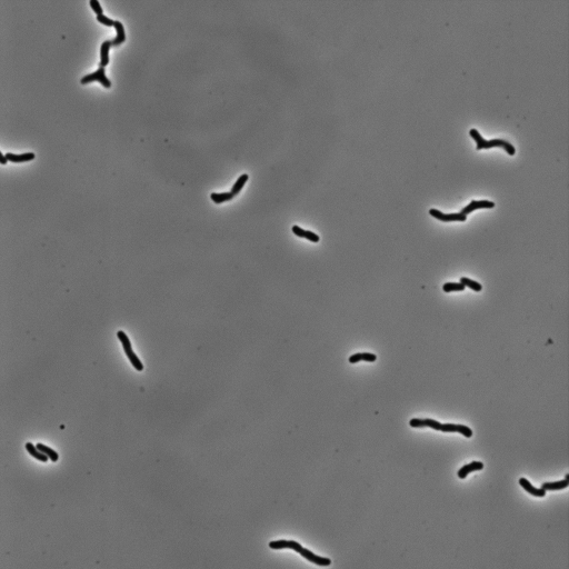
In this image, we can see a variety of cell sizes and shapes. All cells appear to be somewhat elongate with one cell (upper left-hand corner) showing a chained and branched morphology. On the right-hand side of the figure we see the fluorescence image. It appears to be significantly brighter in the center than at the edges due to the Gaussian profile of the excitation beam. This uneven illumination will be corrected for later in this notebook. Since there is a broad distribution of cell fluorescence in the right-hand image, we will perform all segmentation in phase contrast to avoid biasing towards brighter cells.
Segmenting in phase contrast
Performing morpholoical segmentation of small objects in phase contrast is fraught with difficulty. In many cases, it's prefereable to segment in the fluorescence image where the objects of interest are more clearly defined and defects and debris are not detected as objects. However, segmenting in the fluorescence channel here is not viable as it biases the final segmentation towards the brightest objects and the range of fluorescence across the data set can lead to variable segmentation masks and inject bias into the cell-to-cell comparison.
With these restrictions in mind, we chose to stick with segmentation in the phase contrast image, but with a more stringent method than simple intensity thresholding. The raw pixel values of the brightfield images will vary from day-to-day and even image to image across the same sample. To combat this variation, we normalize the image to values between zero and one,
$$ I_{norm} = {I - I_{min} \over I_{max} - I_{min}}, $$
where $I$ is the original image, $I_{min}$ and $I_{max}$ are the minimum and maximum pixel value in the image.
We can also correct for the large-scale variations in the background due to oil bubbles, imperfections in the agar substrate, and uneven illumination by performing a background subtraction. To do so, we will create Gaussian blur the image such that the individual cells are lost whereas the large-scale variations will remain.
# Normalize the image and perform background subtraction.
bf_norm = (bf - bf.min()) / (bf.max() - bf.min())
bf_blur = skimage.filters.gaussian(bf_norm, sigma=5)
bf_sub = bf_norm - bf_blur
# Show the original and the subtracted version.
p1 = mscl.plotting.imshow(bf_norm, length_units='µm', interpixel_distance=0.16,
plot_height=325, color_mapper='Greys_r')
p2 = mscl.plotting.imshow(bf_sub, length_units='µm', interpixel_distance=0.16,
plot_height=325, color_mapper='Greys_r')
# Link axes for simultaneous zooming
p2.x_range = p1.x_range
p2.y_range = p1.y_range
# Format the plots
p1.title.text = 'normalized image'
p2.title.text = 'background subtracted image'
# Arrange and display the plot.
row = bokeh.layouts.gridplot([[p1, p2]])
bokeh.io.show(row)
As can be seen in the right-hand image, the background intensity is far more uniform and the bacteria are more pronounced as the bright halo is diminished.
To further diminish this halo and clarify septa between dividing cells, we can perform black tophat filtering which makes darker regions of the image far more pronounced. To do so, we must provide a kernel that is larger than our bacteria. In the cell below, we peform this filtering with a disk-shaped kernel with a radius of 20 pixels.
To idenfify the cell regions, we chose to identify the contours of the black tophat transformed image at a specified level. The level 0.3 set below is arbitrary and was determined by trial and error across a variety of image sets. The object contours identified are shown as red lines in the image below.
# Perform black tophat filtering
selem = skimage.morphology.disk(20)
bf_tophat = skimage.morphology.black_tophat(bf_sub, selem)
# Find the contours.
conts = skimage.measure.find_contours(bf_tophat, 0.3)
# Set up the figure canvas
p1 = mscl.plotting.imshow(bf_tophat, length_units='µm', interpixel_distance=0.16,
plot_height=325)
p2 = mscl.plotting.imshow(bf_norm, color_mapper='Greys_r', length_units='µm',
interpixel_distance=0.16, plot_height=325)
# Plot the contours
for i, c in enumerate(conts):
c = np.round(c)
x = c[:, 1] * ip_dist
# Adjustment of 512 is for visualization purposes
y = np.abs(c[:, 0] - 512) * ip_dist
p2.line(x, y, color='tomato')
# Format the axes.
p2.x_range = p1.x_range
p2.y_range = p1.y_range
p1.title.text = 'black tophat transform'
p2.title.text = 'identified cell boundaries'
# Assemble and display the image.
row = bokeh.layouts.gridplot([[p1, p2]])
bokeh.io.show(row)
We can see that we faithfully identify cell regions using this contouring method. We occasionally segment small background particles and cells cut off by the edge of the image. We can easily remove these imperfections through simple morphological operations. Below, we converted these contours to a filled segmentation mask that will be used for the fluorescence quantification.
# Instantiate the blank image.
blank_im = np.zeros_like(bf_norm)
for i, c in enumerate(conts):
# Convert to integers as required by image.
c_int = np.round(c).astype(int)
blank_im[c_int[:, 0], c_int[:, 1]] = 1.0
# Fill the holes generated by contour burning.
objects = scipy.ndimage.binary_fill_holes(blank_im)
# Remove any small objects.
objects = skimage.morphology.remove_small_objects(objects)
# Label the segmentation mask.
mask = skimage.measure.label(objects)
# Display the original phase image and the segmented mask.
p1 = mscl.plotting.imshow(bf_norm, interpixel_distance=ip_dist, length_units='µm',
plot_height=325, color_mapper='Greys_r')
paired = bokeh.models.LinearColorMapper(bokeh.palettes.Paired11)
p2 = mscl.plotting.imshow(mask, interpixel_distance=ip_dist, length_units='µm',
plot_height=325, color_mapper='viridis')
# Format the axes.
p2.x_range = p1.x_range
p2.y_range = p1.y_range
p1.title.text = 'original image'
p2.title.text = 'segmentation mask'
# Assemble and display the figure.
row = bokeh.layouts.gridplot([[p1, p2]])
bokeh.io.show(row)
Each colored object in the right-hand image is a unique label. We sometimes segment small clusters of cells (lower left-hand corner) as individual objects, but this is a small proportion of the segmented cells.
Connecting manual markers to segmented objects
As the cells are not cemented to the imaging surface, lineage tracking becomes an almost impossible task. As the read out for survival or death is relatively obvious, we decided to manually identify which cells survived or died, and mark their locations on the image. A representative movie after osmotic shock is shown below.
For this work, we defined a surviving cell as one that was able to undergo two subsequent cell divisions after the osmotic shock. Cells that detatched from the surface or were not visible in the fluorescence image were neglected.
The coordinates of each surviving cell were marked using the CellProfiler plugin for ImageJ. Cells that died were labeled with a 1.0 and those that survived with 2.0. For each imaged position, the marked locations were saved as an .xml file that we then read into Python and processed. The cell below demonstrates how one of these .xml files were parsed to produce a DataFrame with positions and survival identifier for each click.
# Load the marker files
markers = np.sort(glob.glob('../../data/20170517*/*.xml'))
markers = markers[6]
# Extract the information from the marker file.
with open(markers, 'r') as f:
positions = xmltodict.parse(f.read())
# Define the survival dictionary for marker type.
type_dict = {1: False, 2: True}
# Extract the marker locations and classifications
locs = positions['CellCounter_Marker_File']['Marker_Data']['Marker_Type']
dfs = []
# Loop through the two types we care about and extract the locations and survival
for i in range(2):
type_marks = locs[i]['Marker']
_df = pd.DataFrame(type_marks)
_df['survival'] = type_dict[int(locs[i]['Type'])]
dfs.append(_df)
# Remove unnecessary columns and rename
marker_df = pd.concat(dfs, axis=0, ignore_index=True)
marker_df.drop('MarkerZ', 1, inplace=True)
marker_df.columns = ['x_pos', 'y_pos', 'survival']
# Convert the locations to integers from strings.
marker_df['x_pos'] = marker_df['x_pos'].astype(int)
marker_df['y_pos'] = marker_df['y_pos'].astype(int)
# Display the first five entries of the dataframe
marker_df.head()
With a list of the positions and their survivability, we can try to connect these clicks with the corresponding segmented object. Since these clicks were registered on the first image of the growth movie, the positions do not exactly match up with the positions of the segmented cells. Below, we compute the location of the centroids and plot them ontop of the original image along with the mouse clicks.
# Extract the centroids of the segmentation mask.
props = skimage.measure.regionprops(mask)
centroids = [p.centroid for p in props]
# Plot the original image with the click locations highlighted.
p1 = mscl.plotting.imshow(bf_norm, length_units='µm', interpixel_distance=0.16,
plot_height=500, color_mapper='Greys_r')
# Add the points.
for i in range(len(marker_df)):
click_x, click_y = marker_df.iloc[i][['x_pos', 'y_pos']]
p1.circle(click_x * ip_dist, np.abs(click_y - 512) * ip_dist,
color='tomato', legend='manual marker')
for cent in centroids:
p1.circle(cent[1] * ip_dist, np.abs(cent[0] - 512) * ip_dist,
color='dodgerblue', legend='object centroid')
bokeh.io.show(p1)
These slight shifts mean that we must have some automated way to correctly assign the pairings. To do so, we can calculate all pairwise distances between the centroids of the segmented objects and the click positions. We can then impose a distance limit, saying anything closer than a few microns is a correct pairing. The following code cell performs this operation, maintaining linkages that are within five microns of the object centroid.
# Extract the labels of the segmented objects
labels = [p.label for p in props]
# Loop through each label and find the minumum distance for each marker
link_df = pd.DataFrame([])
for i, label in enumerate(labels):
# Find the centroid.
cent_y, cent_x = centroids[i]
# Loop through each marker and compute the distances
for j in range(len(marker_df)):
click_x, click_y = marker_df.iloc[j][['x_pos', 'y_pos']]
_dist = np.sqrt((cent_x - click_x)**2 + (cent_y - click_y)**2)
# Restrict to distance within 5µm
if _dist <= (5 / ip_dist):
df_dict = {'centroid_x':cent_x, 'centroid_y':cent_y, 'marker_x':click_x,
'marker_y': click_y, 'dist':_dist, 'mask_label':label,
'survival':marker_df.iloc[j]['survival']}
link_df = link_df.append(df_dict, ignore_index=True)
# Display the linkages
p1 = mscl.plotting.imshow(bf_norm, color_mapper='Greys_r', plot_height=500,
length_units='µm', interpixel_distance=ip_dist)
for i in range(len(link_df)):
slc = link_df.iloc[i]
p1.circle([slc['centroid_x']*ip_dist, slc['marker_x']*ip_dist],
[np.abs(slc['centroid_y'] - 512)*ip_dist, np.abs(slc['marker_y'] - 512)*ip_dist],
color='dodgerblue', size=5, legend='points')
p1.line([slc['centroid_x']*ip_dist, slc['marker_x']*ip_dist],
[np.abs(slc['centroid_y'] - 512)*ip_dist, np.abs(slc['marker_y'] - 512)*ip_dist],
color='tomato', line_width=2, legend='connections')
bokeh.io.show(p1)
In this figure, the centroids of the segmented objects and clicked points are marked in blue and the red lines show the connections between them. While in many cases the cells divided in between the capture of the phase contrast image and the outgrowth movie, the clicks are properly marked to the mother cell.
All linkage information, including the ID of the mother cell and the associated click marks are stored in a tidy pandas DataFrame, as seen below. The next section details the intersection of this segmentation mask and the expression level
# Show the linkage dataframe
link_df.head()
Filtering of fluorescence image and measurement
The next step in our image processing safari is to connect the linked segmentation mask to the fluorescence image, shown below.
# Show the example fluorescence image.
p1 = mscl.plotting.imshow(gfp, interpixel_distance=ip_dist, plot_height=500,
length_units='µm')
bokeh.io.show(p1)
There are a few glaring issues with the raw fluorescence image. Perhaps the most obvious is that the background is not uniformly fluorescent. In fact, it appears to be much more fluorescent in the center than it is at the edges. This is due to the Gaussian profile of the excitation wavelength, which is an expanded 488 nm laser. As we care very much about the raw pixel values, we cannot do any normalization and background subtraction as this would rescale the pixel values. However, we can create a look up table of the average illumination profile and correct the intensity pixel-by-pixel. Mathematically, we will compute
$$ I_{flat} = {I^{i,j} \over I_{illumination}^{i,j}} \langle I_{illumination}\rangle, $$
where $I_{illumination}$ is the average image of the illumination profile and $i,j$ indicates the $i^{th}$ and $j^{th}$ pixel in the $x$ and $y$ dimension.
To generate the illumination profile, we can take an image series of a homogeneously fluorescent slide and compute the average. While this was performed for most of the data sets, some experiments did not have an associated fluorescent slide image set. To correct the illumination for these samples, we computed the median projection of the entire image set for that experiment and used this as the illumination profile. We did not see any adverse effects from this correction versus a fluorescent slide. This correction is performed below.
# Compute the median illumination profile.
illum = np.median(gfp_ims, axis = 0)
# Flatten the fluorescence image.
gfp_flat = (gfp / illum) * np.mean(illum)
# Show all three.
p1 = mscl.plotting.imshow(gfp, length_units='µm', interpixel_distance=ip_dist,
plot_height=325)
p2 = mscl.plotting.imshow(gfp_flat, length_units='µm', interpixel_distance=ip_dist,
plot_height=325)
# Format the axes
p2.x_range = p1.x_range
p2.y_range = p2.y_range
# Label and show the images.
p1.title.text = 'original image'
p2.title.text = 'flattened image'
row = bokeh.layouts.gridplot([[p1, p2]])
bokeh.io.show(row)
Another source of error is the high frequency noise from the camera. As we are interested in calculating the total fluorescence of each cell, it's important to reduce this as much as possible such that we are reading the intensity due only to the fluorescence of the MscL-sfGFP protein. To do so, we performed a simple median filtering of each individual image using a 3x3 square structuring element, replacing each pixel in this square with the median value.
# Median filter the flattened image.
selem = skimage.morphology.square(3)
gfp_filt = scipy.ndimage.median_filter(gfp_flat, footprint=selem)
# Show the original and median filtered image
p1 = mscl.plotting.imshow(gfp, length_units='µm', interpixel_distance=ip_dist,
plot_height=325)
p2 = mscl.plotting.imshow(gfp_filt, length_units='µm', interpixel_distance=ip_dist,
plot_height=325)
# Format the axes
p2.x_range = p1.x_range
p2.y_range = p2.y_range
# Label and show the images.
p1.title.text = 'original image'
p2.title.text = 'flattened image'
row = bokeh.layouts.gridplot([[p1, p2]])
bokeh.io.show(row)
With this corrected fluorescent image, we are ready to pull everything together and map expression to survival.
Pulling it all together
# Measure the fluorescence region properties.
fluo_props = skimage.measure.regionprops(mask, gfp_flat)
# Assemble a dataframe of the labels and mean intensity
labels = [p.label for p in fluo_props]
intensity = [p.mean_intensity for p in fluo_props]
fluo_df = pd.DataFrame(np.array([labels, intensity]).T,
columns=['mask_label', 'mean_pixel_intensity'])
# Generate a new data frame with each cell measurement.
survival_df = pd.DataFrame([], columns=['mean_pixel_intensity', 'survival'])
for i in range(len(link_df)):
# Find the label of the cell measurement.
cell = link_df.iloc[i]['mask_label']
# Extract the survival identity.
survival = link_df.iloc[i]['survival']
# Identify the appropriate intensity.
intensity = fluo_df.loc[fluo_df['mask_label']==cell]['mean_pixel_intensity'].values[0]
# Append the values to a new dataframe.
cell_dict = {'mean_pixel_intensity':intensity, 'survival':survival}
survival_df = survival_df.append(cell_dict, ignore_index=True)
# Print the results.
survival_df
This procedure was repated for every image in this work. Other quantities, such as cell area and image exposure time, were computed as well and were compiled into a single csv file.